Reading and Interpreting Graphs
In this lesson we will look at how to gain information from a graph. We will see how to find a value of y given a value of x. Finally we will compare two graphs.
When we look at a graph, the most important question we can ask is, "If we know the value of x, can we find the value of y?" In applications, rarely are x and y labeled on a graph. Labels will more likely be words phrases.
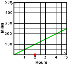
Consider the example below which is a graph that relates the hours that a car has been on the road to the number of miles that the car has been on the road.

One question that we may ask is, "After 2 hours how far has the car traveled?" To answer this question, we first plot the point on the horizontal axis (x-axis).
Next move up from the point until we hit the graph and mark this point of intersection
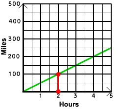
Finally, from the point of intersection, move to the left until you hit the vertical axis (y-axis).
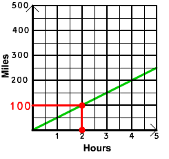
The value on the vertical axis will be the value that we are looking for. We can conclude that after 2 hours the car has traveled 100 miles.
An animation of this is shown below.
Now try one by yourself. If you want to see the answer, put your mouse on the yellow rectangle and the answer will appear.
Exercise 1
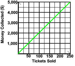
The graph below displays the relationship between the amount of money a theater collects and the number of tickets the theater sells. Determine the amount of money the theater will collect if it sells 150 tickets.
Answer
![]()
Now lets look at an example that asks us to find "x" when we know "y".
Example 2
The graph below displays the relationship between the number of printers in use in an office and the number of pages per minute that can be printed in the office.
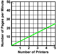
How many printers does the office need to have in order to be able to print 15 pages per minute?
Solution
This example differs from the last one in that it gives the "y" value and asks us to find the "x" value. First notice that 15 pages per minute corresponds to a value on the vertical axis. We will need to find the number of printers needed, which is a value on the horizontal axis. The strategy is to work in reverse. Start at the point 15 on the vertical axis. The number 15 is not explicitly labeled; however, we know that 15 his halfway between 10 and 20. So we start halfway between 10 and 20 and move to the right until we hit the graph. The picture of this is shown below
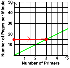
Now move directly down to the horizontal axis.
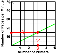
We can conclude that 3 printers are needed.
Now try one by yourself. If you want to see the answer, put your mouse on the yellow rectangle and the answer will appear.
Exercise 2
The graph below displays the relationship between the number of burgers that are ordered at a fast food restaurant and the number of hot dogs are ordered .
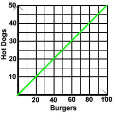
Today, there were 25 hot dogs sold. How many burgers did the restaurant sell today?
Answer
![]()
Often on the CAHSEE, problems are given where two graphs are shown. The CAHSEE asks for a comparison between the two graphs: either when is one graph above another or how much higher is one graph than the other for a given value.
Here is a typical example.
Example 3
Jorge and Maria leave their houses to go to work. Jorge walks to the bus stop and then takes the bus the rest of the way. Maria takes her bicycle. The graphs that relate the travel time to their distance traveled are shown below.
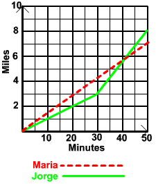
For what times has Jorge traveled farther than Maria?
Solution
If we look at the graphs, Jorge will have traveled farther than Maria if Jorge's graph (solid) is higher than Maria's graph (dashed). This is because the height of the graph represents miles. Notice that at the beginning, the solid line is below the dashed line. When the number of minutes reaches 40, the graphs have the same height. After 40, the solid line is above the dashed line. We can conclude that Jorge has traveled farther than Maria for any time after 40 minutes.
Now try one by yourself. If you want to see the answer, put your mouse on the yellow rectangle and the answer will appear.
Exercise 3
The graphs below displays the number of men and women who are exercising in the gym in the afternoon.
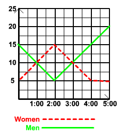
For what times were there more women than men exercising in the gym?
Answer
![]()
The next example in this lesson looks at seeing how much higher one graph is compared to another.
Example 4
The graphs below display the relationship between the number of grams of cereal and the number of calories for two types of cereal.
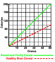
If Jackie and Rick each have 20 grams of cereal for breakfast, but Jackie has Sweet and Fruity Cereal and Rick has Healthy Bran Cereal, how many more calories is Jackie consuming compared to Rick?
Solution
The strategy for solving this problem is to first figure out how many calories each consumed. Then we can subtract Rick's calorie consumption from Jackie's.
From the graphs we see that
20 grams of Sweet and Fruity Cereal = 80 calories
and
20 grams of Healthy Bran Cereal = 40 calories
If you having difficulty coming up with 80 and 40, go back to Example 1.
We see that Jackie consumed 80 calories and Rick consumed 40 calories. Now to find out how many more calories Jackie consumed compared to Rick, we just subtract
Jackie's Calories - Rick's Calories
= 80 - 40
= 40
We can conclude that Jackie consumed 40 more calories than Rick.
Now try one by yourself. If you want to see the answer, put your mouse on the yellow rectangle and the answer will appear.
Exercise 4
The graphs below displays the hours vs. wages for a union worker and for a nonunion worker.
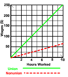
How much more money will the union worker receive compared to the nonunion worker if they both work 8 hours?
Answer
![]()
The final example asks us to recognize a graph when some data is given.
Example 5
U-Rents charges $5 per hour for the use of their high powered drill. Which of the four graphs shown below shows the relationship between the number of hours the high powered drill is rented and the cost of renting for that number of hours?
A
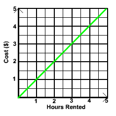 B
B
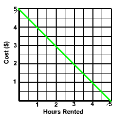
C
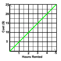 D
D
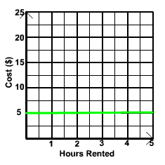
Solution
We will look at the information given and see what graphs it cannot be. First, it costs $5 per hour to rent. Renting for 1 hour will cost $5. The graph must pass through the point (1,5). A and B can be ruled out since they pass through (1,1) and (1,4) respectively. Next, if the drill is rented out for 2 hours, then the cost will be
Cost for 2 Hours = (2)(5)
= 10
The graph must pass through the point (2,10). Graph C does pass through this point, but graph D passes through the point (2,5). The correct graph must be graph C.
Now try one by yourself. If you want to see the answer, put your mouse on the yellow rectangle and the answer will appear.
Exercise 5
LA Coffeehouse has 500 pounds of coffee beans at the start of the day. The customers buy and consume 50 pounds of coffee per hour. Which of the graphs below shows the relationship between the number of hours since opening and the pounds of coffee left at LA Coffeehouse?
A
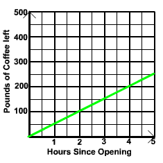 B
B
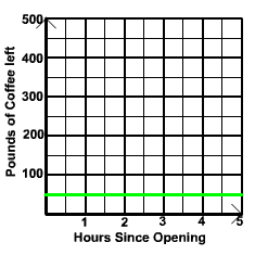
C
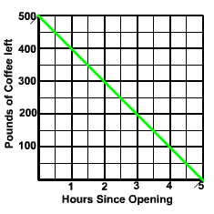 D
D
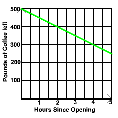
Answer
![]()