Mary Griffin
201 Stats
December 1, 2003
Statistic Project
For my project I decided to see weather or not age has anything to do with the amount of money spent in the store that I work for. I asked 50 people, after they purchased merchandise from my store, what there age was and then I correlated their purchases’ monetary value with their age. Using my knowledge from working there I decided that my hypothesis or H would be that the age of the customer and the amount purchased is depended on each other. Therefore my H naught is that the age of the customer and the amount purchased is independent. Because I only included the people that bought items in the store that I work for, the sampling is called a convenient sampling. In this paper I will include graphs such as a histogram for both age and amount spent, and compare both. I will also show a Box and Whisker, Stem and Leaf and Scatter Plot graphs in order to prove my H.
First graph is a Histogram of the ages of customers. The Y axis represents the number of times the age occurs and the X axis represents the age. As the graph shows the frequency of the ages is greater in the ages between 20 and 30. While relatively the same number of ages fell between 30 and 50 and later between 50 and 70, this graph would be labeled unimodal and it is skewed to the right.

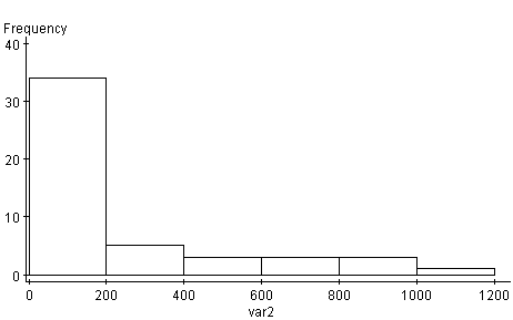
Next graph is also a Histogram, but this one shows and amount spent. The X axis represents that amount spent, while the Y axis shows the frequency in which they (amounts) occur. The majority of the data lies in between the dollar amount of 0 to 200 and the rest mostly evenly scattered between 200 and 1200. This graph is unimodal as well as skewed to the right.
The following graph is called a Stem and Leaf graph. This graph shows the data by taking the first digit (depending on the data) and stacking them to for the stem. The second digit (also depending on the data) is lined up to create the leaf. While there can be multiples of the same numbers in the leaves, the stem numbers are only represented by one number. For example if there was two 19s in the data set, both 9s would be placed in the leaf but only one 1 would be shown on the stem as seenbelow. Variable 1 is the ages while Variable 2 is the amount spent. Looking at these graphs it is easy to see why they are called Stem and Leaf plots.
Variable: var1
1 : 77799999
2 : 00000111224444479
3 : 22223347779
4 : 0112244556
5 : 24
6 : 38
Variable: var2
0 : 01133344555555788899000011112334
1 : 56
2 : 116
3 : 46
4 : 356
High: 612.62, 671.56, 672.37, 820.63, 907.13, 970.54, 1009.03
The next graph is called a Box and Whisker graph. This graph cuts the data set into quarters or quartiles. The box contains the 2nd and 3rd quartiles while the 1st and 4th and denoted by the extended arms. Here it shows that the medium or middle of the data is at or a little beyond 30. The Box and Whisker plot not only gives the medium but also the inter-quartile range. It also shows where the majority of the data is held, on a number line, and also represents numbers that are farther away for the medium by the arms. In this case the right arm tells that the numbers between about 41 and 70 are farther apart than those between 20 and 40.

For this experiment the most useful graph would be the Scatter Plot. Here the X axis is the amount spent and the Y axis in the age. Unlike the previous graphs this one represents the bi-variant (both variables: age and monetary amount) data on one graph. When an age in the data set is equivalent to an amount, it is shown by a dot. This plot will show if there is any correlation between the data.

By using WebStat3.0 the p value is < .0001 or .0509 therefore there is a medium correlation with the data sets (given that .5<R>.8 = Medium correlation, R>.8= High correlation and R<.5= Low to no correlation). Given the P-value and the fact that P is > .1, I then can conclude that I can reject H naught and say that the age, of the customer at my store, is dependent on how much is spent in sales by that person.